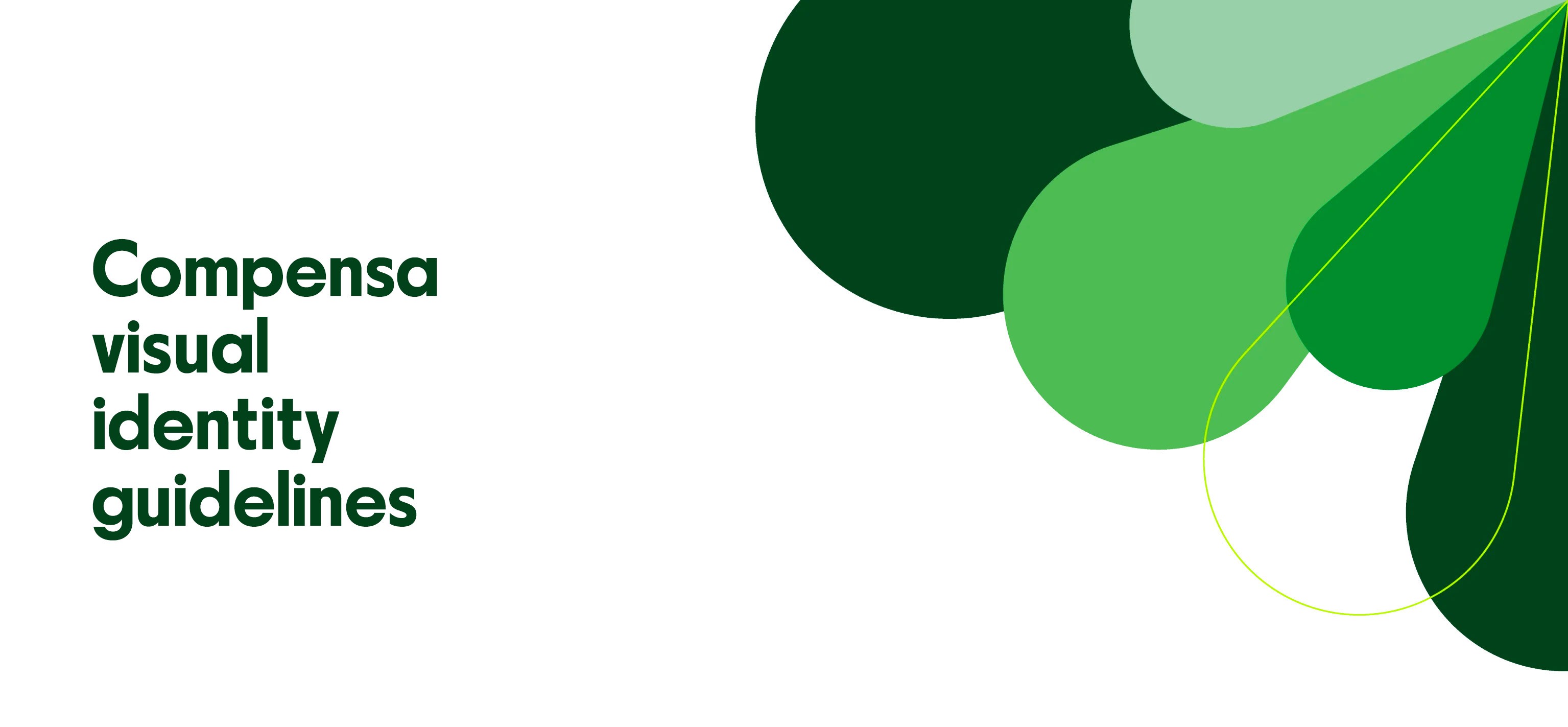
Positioning
Positioning
Positioning
We protect what’s important and give you courage
We protect what’s important and give you courage
We protect what’s important and give you courage
Insurance does not have to be all about care and tenderness. After all, security gives us confidence and determination to move ahead, into the future.
Insurance does not have to be all about care and tenderness. After all, security gives us confidence and determination to move ahead, into the future.
Insurance does not have to be all about care and tenderness. After all, security gives us confidence and determination to move ahead, into the future.
Compensa’s clients can boldly rest assured when they have someone to protect what’s important. We can encourage them to have more assurance in engaging into things that matter in their lives, having a reliable partner in us behind their back.
Compensa’s clients can boldly rest assured when they have someone to protect what’s important. We can encourage them to have more assurance in engaging into things that matter in their lives, having a reliable partner in us behind their back.
Compensa’s clients can boldly rest assured when they have someone to protect what’s important. We can encourage them to have more assurance in engaging into things that matter in their lives, having a reliable partner in us behind their back.
Travelling to distant lands is easier when you know that your home is safe. You feel more assurance when you let your kid go out. And the future does not look so very uncertain when you have unit-linked life insurance.
While business can approach the coming year without fear when it is protected against the worst.
Logo
Logo
Logo

This is the main logo in its original colours. It is used for the purposes of press communication and online.
This is the main logo in its original colours. It is used for the purposes of press communication and online.
This is the main logo in its original colours. It is used for the purposes of press communication and online.
Logo structure
Logo structure
Logo structure

The logo consists of the name, the symbol, a dash, and a legend. The logo can only be used with all the elements present.
The logo consists of the name, the symbol, a dash, and a legend. The logo can only be used with all the elements present.
The logo consists of the name, the symbol, a dash, and a legend. The logo can only be used with all the elements present.
Minimum logo size
Minimum logo size
Minimum logo size

The minimum size of the logo is 25 mm in print and 140 px in digital media. Smaller logos can be illegible.
The minimum size of the logo is 25 mm in print and 140 px in digital media. Smaller logos can be illegible.
The minimum size of the logo is 25 mm in print and 140 px in digital media. Smaller logos can be illegible.
Logo buffer area
Logo buffer area
Logo buffer area

To ensure the legibility of the logo, its buffer area must be free from any other graphic elements. The buffer area around the logo is the height of the red dash and the Vienna Insurance Group subtitle.
To ensure the legibility of the logo, its buffer area must be free from any other graphic elements. The buffer area around the logo is the height of the red dash and the Vienna Insurance Group subtitle.
To ensure the legibility of the logo, its buffer area must be free from any other graphic elements. The buffer area around the logo is the height of the red dash and the Vienna Insurance Group subtitle.
Logo size
Logo size
Logo size
The size of the logo in main formats amounts to ¼ of the width of the short side of the format. The recommended minimum size of the logo’s margin is the width of one character in the logo.
This rule does not apply with small or custom paste-ups.
The size of the logo in main formats amounts to ¼ of the width of the short side of the format. The recommended minimum size of the logo’s margin is the width of one character in the logo.
This rule does not apply with small or custom paste-ups.
The size of the logo in main formats amounts to ¼ of the width of the short side of the format. The recommended minimum size of the logo’s margin is the width of one character in the logo.
This rule does not apply with small or custom paste-ups.

Logo proportions
Logo proportions
Logo proportions

Any enlargement or reduction of the logo must be done to scale.
Any enlargement or reduction of the logo must be done to scale.
Any enlargement or reduction of the logo must be done to scale.
Logo colours
Logo colours
Logo colours

This is the main original colour of the logo. All external communications use a coloured logo on a white background.
This is the main original colour of the logo. All external communications use a coloured logo on a white background.
This is the main original colour of the logo. All external communications use a coloured logo on a white background.

This is the secondary colour of the logo. A white logo on a coloured background can be used for internal communication (such as in presentations, annual reports, banners, and so on).
This is the secondary colour of the logo. A white logo on a coloured background can be used for internal communication (such as in presentations, annual reports, banners, and so on).
This is the secondary colour of the logo. A white logo on a coloured background can be used for internal communication (such as in presentations, annual reports, banners, and so on).

If the background is light-coloured, and the print does not allow using a coloured logo, a black logo will be used.
If the background is light-coloured, and the print does not allow using a coloured logo, a black logo will be used.
If the background is light-coloured, and the print does not allow using a coloured logo, a black logo will be used.

If the background is dark, and the print does not allow using a coloured logo, a white logo will be used.
If the background is dark, and the print does not allow using a coloured logo, a white logo will be used.
If the background is dark, and the print does not allow using a coloured logo, a white logo will be used.
Logo colour coding
Logo colour coding
Logo colour coding
Compensa green
Compensa green
Compensa green
HEX #007b34
RGB 0, 123, 52
CMYK 100, 0, 100, 25
PMS PANTONE 356
HEX #007b34
RGB 0, 123, 52
CMYK 100, 0, 100, 25
PMS PANTONE 356
HEX #007b34
RGB 0, 123, 52
CMYK 100, 0, 100, 25
PMS PANTONE 356
White
White
White
HEX #FFFFFF
RGB 255, 255, 255
CMYK 0, 0, 0, 0
PMS PANTONE White
HEX #FFFFFF
RGB 255, 255, 255
CMYK 0, 0, 0, 0
PMS PANTONE White
HEX #FFFFFF
RGB 255, 255, 255
CMYK 0, 0, 0, 0
PMS PANTONE White
Red
Red
Red
HEX #ff0000
RGB 255, 0, 0
CMYK 0, 100, 100, 0
PMS PANTONE 485
HEX #ff0000
RGB 255, 0, 0
CMYK 0, 100, 100, 0
PMS PANTONE 485
HEX #ff0000
RGB 255, 0, 0
CMYK 0, 100, 100, 0
PMS PANTONE 485
Black
Black
Black
HEX #000000
RGB 0, 0, 0
CMYK 0, 0, 0, 100
PMS PANTONE Black 6
HEX #000000
RGB 0, 0, 0
CMYK 0, 0, 0, 100
PMS PANTONE Black 6
HEX #000000
RGB 0, 0, 0
CMYK 0, 0, 0, 100
PMS PANTONE Black 6
Logo position on the layout
Logo position on the layout
Logo position on the layout

Logo on a multi-coloured background
Logo on a multi-coloured background
Logo on a multi-coloured background

When the logo has to be used against a multi-coloured background, the logo will be arranged on the left, at the top or at the bottom of a white graphic element (paste-up).
When the logo has to be used against a multi-coloured background, the logo will be arranged on the left, at the top or at the bottom of a white graphic element (paste-up).
When the logo has to be used against a multi-coloured background, the logo will be arranged on the left, at the top or at the bottom of a white graphic element (paste-up).
Logo in social media
Logo in social media
Logo in social media
Only the symbol, rather than the whole logo, will be used for a social media profile picture.
Only the symbol, rather than the whole logo, will be used for a social media profile picture.
Only the symbol, rather than the whole logo, will be used for a social media profile picture.

Unacceptable uses of the logo
Unacceptable uses of the logo
Unacceptable uses of the logo

Rearranging the elements of the logo
Rearranging the elements of the logo
Rearranging the elements of the logo

Tilting the logo
Tilting the logo
Tilting the logo

Changing the size of the elements of the logo
Changing the size of the elements of the logo
Changing the size of the elements of the logo

Changing the proportions of the logo
Changing the proportions of the logo
Changing the proportions of the logo

Changing the colour of the logo
Changing the colour of the logo
Changing the colour of the logo

Using the logo on a background that does not provide contrast
Using the logo on a background that does not provide contrast
Using the logo on a background that does not provide contrast

Using a multi-coloured logo on a dark background
Using a multi-coloured logo on a dark background
Using a multi-coloured logo on a dark background

Using other elements next to the logo
Using other elements next to the logo
Using other elements next to the logo

Using the logo on a multi-coloured background
Using the logo on a multi-coloured background
Using the logo on a multi-coloured background
Compensa identity colours
Compensa identity colours
Compensa identity colours
The main colours are used with large areas and for backgrounds.
The main colours are used with large areas and for backgrounds.
The main colours are used with large areas and for backgrounds.
Compensa green
Compensa green
Compensa green
HEX #007b34
RGB 0, 123, 52
CMYK 100, 0, 100, 25
PMS PANTONE 356
HEX #007b34
RGB 0, 123, 52
CMYK 100, 0, 100, 25
PMS PANTONE 356
HEX #007b34
RGB 0, 123, 52
CMYK 100, 0, 100, 25
PMS PANTONE 356
White
White
White
HEX #FFFFFF
RGB 255, 255, 255
CMYK 0, 0, 0, 0
PMS PANTONE White
HEX #FFFFFF
RGB 255, 255, 255
CMYK 0, 0, 0, 0
PMS PANTONE White
HEX #FFFFFF
RGB 255, 255, 255
CMYK 0, 0, 0, 0
PMS PANTONE White
Supplementary colours
Supplementary colours
Supplementary colours
The supplementary colours are used in texts.
The supplementary colours are used in texts.
The supplementary colours are used in texts.
Dark green
Dark green
Dark green
HEX #0f421e
RGB 15, 66, 30
CMYK 90, 45, 100, 55
PMS PANTONE 350
HEX #0f421e
RGB 15, 66, 30
CMYK 90, 45, 100, 55
PMS PANTONE 350
HEX #0f421e
RGB 15, 66, 30
CMYK 90, 45, 100, 55
PMS PANTONE 350
Black
Black
Black
HEX #000000
RGB 0, 0, 0
CMYK 0, 0, 0, 100
PMS PANTONE Black 6
HEX #000000
RGB 0, 0, 0
CMYK 0, 0, 0, 100
PMS PANTONE Black 6
HEX #000000
RGB 0, 0, 0
CMYK 0, 0, 0, 100
PMS PANTONE Black 6
Secondary colours
Secondary colours
Secondary colours
Secondary colours are used in graphic elements and in presentations.
Secondary colours are used in graphic elements and in presentations.
Secondary colours are used in graphic elements and in presentations.
Green 1
Green 1
Green 1
HEX #60b265
RGB 96, 178, 101
CMYK 65, 0, 75, 0
PMS PANTONE 7489
HEX #60b265
RGB 96, 178, 101
CMYK 65, 0, 75, 0
PMS PANTONE 7489
HEX #60b265
RGB 96, 178, 101
CMYK 65, 0, 75, 0
PMS PANTONE 7489
Green 2
Green 2
Green 2
HEX #a5d0ac
RGB 165, 208, 172
CMYK 21, 0, 17, 18
PMS PANTONE 344
HEX #a5d0ac
RGB 165, 208, 172
CMYK 21, 0, 17, 18
PMS PANTONE 344
HEX #a5d0ac
RGB 165, 208, 172
CMYK 21, 0, 17, 18
PMS PANTONE 344
Green 3
Green 3
Green 3
HEX #d3e8df
RGB 211, 232, 223
CMYK 20, 0, 15, 0
PMS PANTONE 621
HEX #d3e8df
RGB 211, 232, 223
CMYK 20, 0, 15, 0
PMS PANTONE 621
HEX #d3e8df
RGB 211, 232, 223
CMYK 20, 0, 15, 0
PMS PANTONE 621
Accent colours
Accent colours
Accent colours
Accent colours are used to emphasise important information, such as promotions, special offers, and so on.
Accent colours are used to emphasise important information, such as promotions, special offers, and so on.
Accent colours are used to emphasise important information, such as promotions, special offers, and so on.
Lime green
Lime green
Lime green
HEX #c5f716
RGB 197, 247, 22
CMYK 45, 0, 90, 0
PMS PANTONE 368
HEX #c5f716
RGB 197, 247, 22
CMYK 45, 0, 90, 0
PMS PANTONE 368
HEX #c5f716
RGB 197, 247, 22
CMYK 45, 0, 90, 0
PMS PANTONE 368
Red
Red
Red
HEX #ff0000
RGB 255, 0, 0
CMYK 0, 100, 100, 0
PMS PANTONE 485
HEX #ff0000
RGB 255, 0, 0
CMYK 0, 100, 100, 0
PMS PANTONE 485
HEX #ff0000
RGB 255, 0, 0
CMYK 0, 100, 100, 0
PMS PANTONE 485
Orange
Orange
Orange
HEX #ff5c00
RGB 255, 92, 0
CMYK 0, 70, 100, 0
PMS PANTONE 021
HEX #ff5c00
RGB 255, 92, 0
CMYK 0, 70, 100, 0
PMS PANTONE 021
HEX #ff5c00
RGB 255, 92, 0
CMYK 0, 70, 100, 0
PMS PANTONE 021
Main fonts
Main fonts
Main fonts
Parafina Bold S is the main font for the purposes of visual identity. It is used in headings.
Parafina Bold S is the main font for the purposes of visual identity. It is used in headings.
Parafina Bold S is the main font for the purposes of visual identity. It is used in headings.


Supplementary fonts
Supplementary fonts
Supplementary fonts

Arial Regular is used in all communication where it is not technically feasible to use any of the main fonts (such as in e-mail signatures).
Arial Regular is used in all communication where it is not technically feasible to use any of the main fonts (such as in e-mail signatures).
Arial Regular is used in all communication where it is not technically feasible to use any of the main fonts (such as in e-mail signatures).

Arial Bold is used where supplementary fonts are used for technical reasons and some of the text in a communication needs to be highlighted, when it is not technically feasible to use any of the main fonts (such as in e-mail signatures).
Arial Bold is used where supplementary fonts are used for technical reasons and some of the text in a communication needs to be highlighted, when it is not technically feasible to use any of the main fonts (such as in e-mail signatures).
Arial Bold is used where supplementary fonts are used for technical reasons and some of the text in a communication needs to be highlighted, when it is not technically feasible to use any of the main fonts (such as in e-mail signatures).
Font sizes
Font sizes
Font sizes

This section identifies the recommended font proportions to be observed for the purposes of Compensa’s visual identity.
The size of the font is determined against the size of the main font, X. The levels of fonts scale vis-à-vis one another at a golden ratio of 1:1.333.
These rules apply to all digital and printed formats.
Font colour
Font colour
Font colour

Headings against a white background are always written in dark green
Hex #0f421e
RGB 15, 66, 30
CMYK 90, 45, 100, 55
PMS PANTONE 350
Headings against a white background are always written in dark green
Hex #0f421e
RGB 15, 66, 30
CMYK 90, 45, 100, 55
PMS PANTONE 350
Headings against a white background are always written in dark green
Hex #0f421e
RGB 15, 66, 30
CMYK 90, 45, 100, 55
PMS PANTONE 350

Headings against a coloured background are always written in white
Hex #FFFFFF
RGB 255, 255, 255
CMYK 0, 0, 0, 0
PMS PANTONE White
Headings against a coloured background are always written in white
Hex #FFFFFF
RGB 255, 255, 255
CMYK 0, 0, 0, 0
PMS PANTONE White
Headings against a coloured background are always written in white
Hex #FFFFFF
RGB 255, 255, 255
CMYK 0, 0, 0, 0
PMS PANTONE White

Main text against a white background is always written in black
Hex #000000
RGB 0, 0, 0
CMYK 0, 0, 0, 100
PMS PANTONE Black 6
Main text against a white background is always written in black
Hex #000000
RGB 0, 0, 0
CMYK 0, 0, 0, 100
PMS PANTONE Black 6
Main text against a white background is always written in black
Hex #000000
RGB 0, 0, 0
CMYK 0, 0, 0, 100
PMS PANTONE Black 6

Main text on a coloured background is always written in white
Hex #FFFFFF
RGB 255, 255, 255
CMYK 0, 0, 0, 0
PMS PANTONE White
Main text on a coloured background is always written in white
Hex #FFFFFF
RGB 255, 255, 255
CMYK 0, 0, 0, 0
PMS PANTONE White
Main text on a coloured background is always written in white
Hex #FFFFFF
RGB 255, 255, 255
CMYK 0, 0, 0, 0
PMS PANTONE White

A multi-coloured background may not be used with any text.
A multi-coloured background may not be used with any text.
A multi-coloured background may not be used with any text.
Graphic element
Graphic element
Graphic element

Compensa’s graphic element consists of the petals of the symbol in the Compensa logo. The purpose of the graphic element is to reinforce the recognisability of Compensa’s identity.
Compensa’s graphic element consists of the petals of the symbol in the Compensa logo. The purpose of the graphic element is to reinforce the recognisability of Compensa’s identity.
Compensa’s graphic element consists of the petals of the symbol in the Compensa logo. The purpose of the graphic element is to reinforce the recognisability of Compensa’s identity.
Graphic element colours
Graphic element colours
Graphic element colours

Dark green
Hex #0f421e
RGB 15, 66, 30
CMYK 90, 45, 100, 55
PMS PANTONE 350
Dark green
Hex #0f421e
RGB 15, 66, 30
CMYK 90, 45, 100, 55
PMS PANTONE 350
Dark green
Hex #0f421e
RGB 15, 66, 30
CMYK 90, 45, 100, 55
PMS PANTONE 350

Compensa green
Hex #007b34
RGB 0, 123, 52
CMYK 100, 0, 100, 25
PMS PANTONE 356
Compensa green
Hex #007b34
RGB 0, 123, 52
CMYK 100, 0, 100, 25
PMS PANTONE 356
Compensa green
Hex #007b34
RGB 0, 123, 52
CMYK 100, 0, 100, 25
PMS PANTONE 356

Green 1
Hex #60b265
RGB 96, 178, 101
CMYK 65, 0, 75, 0
PMS PANTONE 4789
Green 1
Hex #60b265
RGB 96, 178, 101
CMYK 65, 0, 75, 0
PMS PANTONE 4789
Green 1
Hex #60b265
RGB 96, 178, 101
CMYK 65, 0, 75, 0
PMS PANTONE 4789

Green 2
Hex #a5d0ac
RGB 165, 208, 172
CMYK 21, 0, 17, 18
PMS PANTONE 344
Green 2
Hex #a5d0ac
RGB 165, 208, 172
CMYK 21, 0, 17, 18
PMS PANTONE 344
Green 2
Hex #a5d0ac
RGB 165, 208, 172
CMYK 21, 0, 17, 18
PMS PANTONE 344

Lime green
Hex #c5f716
RGB 197, 247, 22
CMYK 45, 0, 90, 0
PMS PANTONE 368
Lime green
Hex #c5f716
RGB 197, 247, 22
CMYK 45, 0, 90, 0
PMS PANTONE 368
Lime green
Hex #c5f716
RGB 197, 247, 22
CMYK 45, 0, 90, 0
PMS PANTONE 368

White
Hex #FFFFFF
RGB 255, 255, 255
CMYK 0, 0, 0, 0
PMS PANTONE White
White
Hex #FFFFFF
RGB 255, 255, 255
CMYK 0, 0, 0, 0
PMS PANTONE White
White
Hex #FFFFFF
RGB 255, 255, 255
CMYK 0, 0, 0, 0
PMS PANTONE White
Application of the graphic element
Application of the graphic element
Application of the graphic element
The graphic element must always extend beyond the boundaries of the paste-up.
The graphic element must always extend beyond the boundaries of the paste-up.
The graphic element must always extend beyond the boundaries of the paste-up.

When the paste-up includes a photograph, the graphic element may be used with a space in white.
When the paste-up includes a photograph, the graphic element may be used with a space in white.
When the paste-up includes a photograph, the graphic element may be used with a space in white.

Icons
Icons
Icons
Icons are used in presentations, on the website, on banners, and so on.
Icons are used in presentations, on the website, on banners, and so on.
Icons are used in presentations, on the website, on banners, and so on.


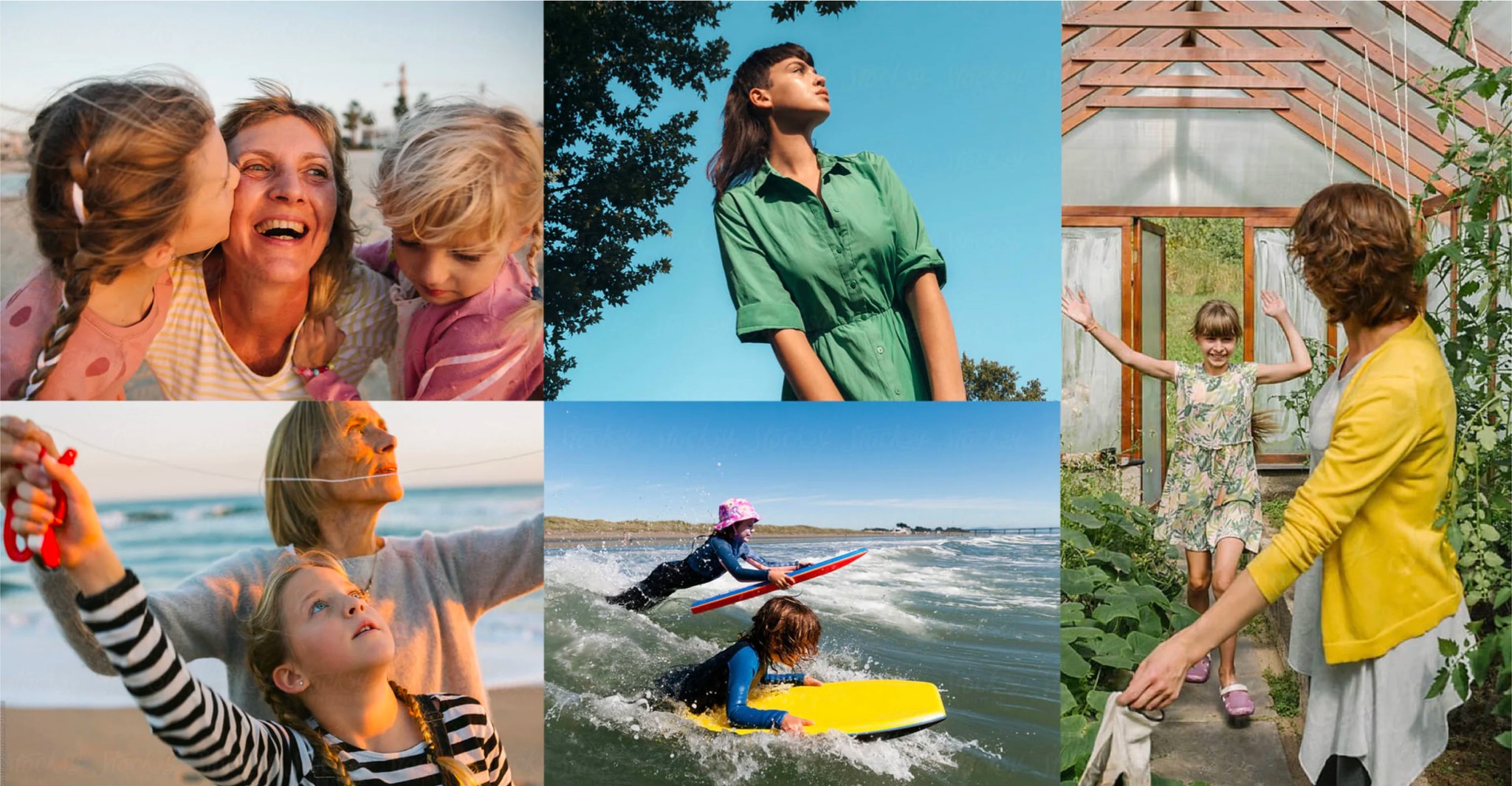
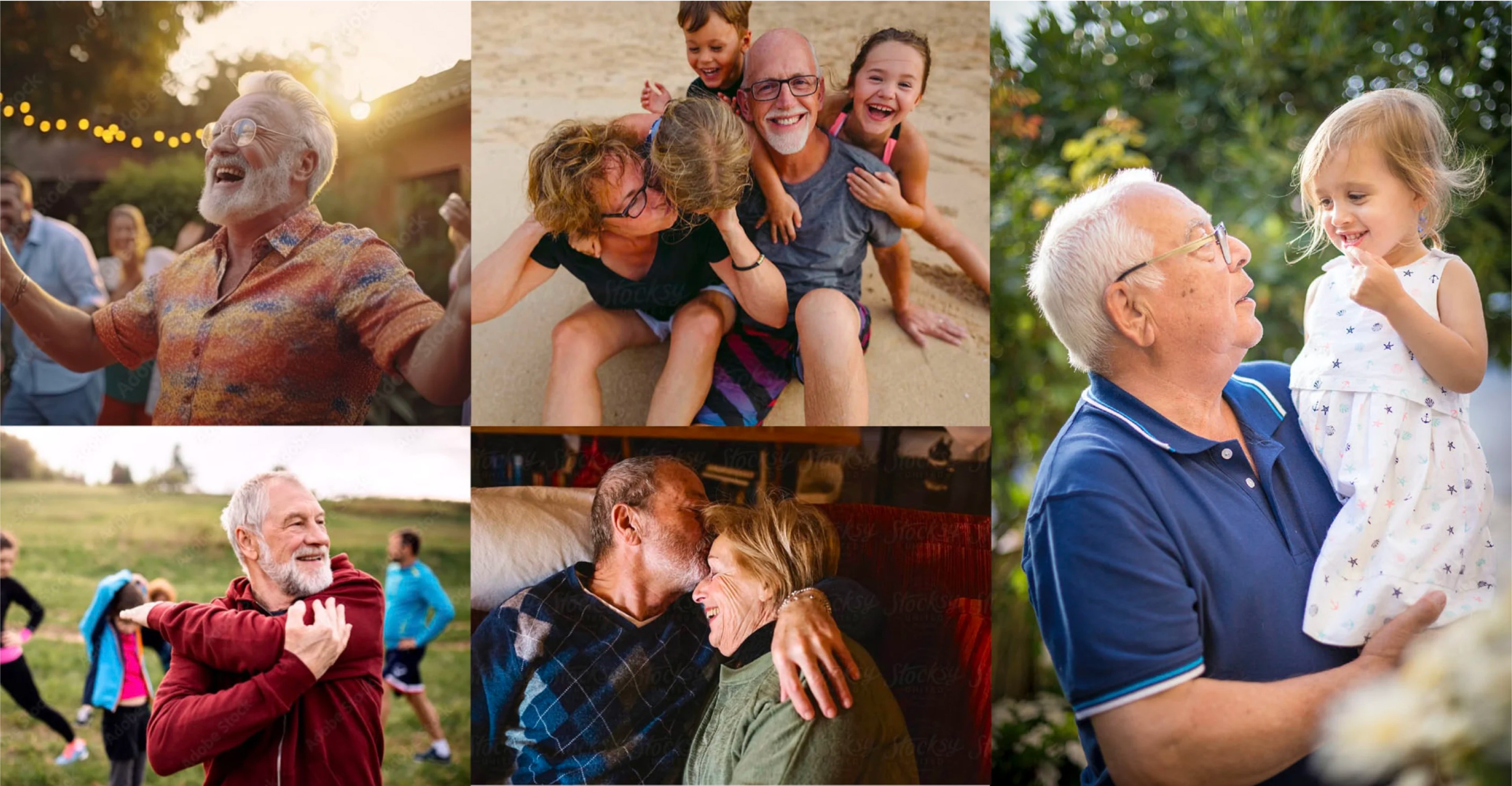
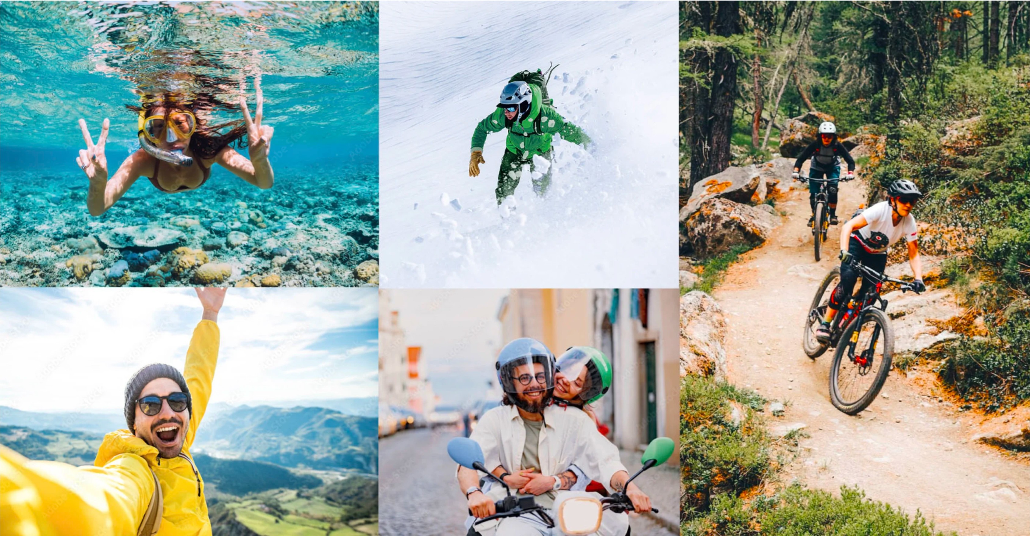
Photographs
Photographs
Photographs
Download photos matching visual identity guidelines.
Download photos matching visual identity guidelines.
Download photos matching visual identity guidelines.
Motion and expression: to reinforce the archetype of a Hero, the recommended option are photographs that show people caught in the act, rather than static. Movement has to look natural and unhindered.
Motion and expression: to reinforce the archetype of a Hero, the recommended option are photographs that show people caught in the act, rather than static. Movement has to look natural and unhindered.
Motion and expression: to reinforce the archetype of a Hero, the recommended option are photographs that show people caught in the act, rather than static. Movement has to look natural and unhindered.
Light: for photographs to radiate an impression of all things natural, ideally, natural light should be used at all times.
Light: for photographs to radiate an impression of all things natural, ideally, natural light should be used at all times.
Light: for photographs to radiate an impression of all things natural, ideally, natural light should be used at all times.
Colours: to highlight the archetype of a Hero, patterns of light, contrasting colours should be used. Bleak, dark photographs are ideally to be avoided.
Colours: to highlight the archetype of a Hero, patterns of light, contrasting colours should be used. Bleak, dark photographs are ideally to be avoided.
Colours: to highlight the archetype of a Hero, patterns of light, contrasting colours should be used. Bleak, dark photographs are ideally to be avoided.
Shot composition: wherever possible, offbeat shot composition should be used. Orderly shot compositions are to be avoided.
Shot composition: wherever possible, offbeat shot composition should be used. Orderly shot compositions are to be avoided.
Shot composition: wherever possible, offbeat shot composition should be used. Orderly shot compositions are to be avoided.
Mood: the key thing is to showcase mood full of vitality, convey an image of freedom and heroism.
Mood: the key thing is to showcase mood full of vitality, convey an image of freedom and heroism.
Mood: the key thing is to showcase mood full of vitality, convey an image of freedom and heroism.
Guaranteed-interest insurance
Guaranteed-interest insurance
Guaranteed-interest insurance
Pension insurance
Pension insurance
Pension insurance
Unit-linked insurance
Unit-linked insurance
Unit-linked insurance
Auto insurance
Auto insurance
Auto insurance

Home insurance
Home insurance
Home insurance

Health insurance
Health insurance
Health insurance

Animation
Animation
Animation
Compensa’s visual identity may include an animated graphic element. The composition of the animated graphic element is subject to the same set of rules as that of a static element
Compensa’s visual identity may include an animated graphic element. The composition of the animated graphic element is subject to the same set of rules as that of a static element
Compensa’s visual identity may include an animated graphic element. The composition of the animated graphic element is subject to the same set of rules as that of a static element
Layout structure
Layout structure
Layout structure
01.
The margin area of the layout is to be determined against the width of the logo’s symbol.
The distance between the logo and the heading also equals the width of the logo’s symbol.
The distance between the heading and the copy is half the width of the logo’s symbol.
01.
The margin area of the layout is to be determined against the width of the logo’s symbol.
The distance between the logo and the heading also equals the width of the logo’s symbol.
The distance between the heading and the copy is half the width of the logo’s symbol.
01.
The margin area of the layout is to be determined against the width of the logo’s symbol.
The distance between the logo and the heading also equals the width of the logo’s symbol.
The distance between the heading and the copy is half the width of the logo’s symbol.

02.
With ad layouts, information is composed against a white background.
02.
With ad layouts, information is composed against a white background.
02.
With ad layouts, information is composed against a white background.

03.
Compensa’s graphic element to be included.
03.
Compensa’s graphic element to be included.
03.
Compensa’s graphic element to be included.

04.
The photograph is inserted beneath the graphic element and the key message.
04.
The photograph is inserted beneath the graphic element and the key message.
04.
The photograph is inserted beneath the graphic element and the key message.

Ad banners
Ad banners
Ad banners
When it comes to designing online ad banners, the recommended option is to use the available templates that are aligned with the guidelines of Compensa’s visual identity.
When it comes to designing online ad banners, the recommended option is to use the available templates that are aligned with the guidelines of Compensa’s visual identity.
When it comes to designing online ad banners, the recommended option is to use the available templates that are aligned with the guidelines of Compensa’s visual identity.
Social media post layouts
Social media post layouts
Social media post layouts

When it comes to designing layouts for social media posts, the recommended option is to use the available templates that are aligned with the guidelines of Compensa’s visual identity.
When it comes to designing layouts for social media posts, the recommended option is to use the available templates that are aligned with the guidelines of Compensa’s visual identity.
When it comes to designing layouts for social media posts, the recommended option is to use the available templates that are aligned with the guidelines of Compensa’s visual identity.
Facebook cover
Facebook cover
Facebook cover

The format of the Facebook cover paste-up is 820 x 360 px. The cover paste-up is designed for good visibility both on a cell phone and a computer.
The format of the Facebook cover paste-up is 820 x 360 px. The cover paste-up is designed for good visibility both on a cell phone and a computer.
The format of the Facebook cover paste-up is 820 x 360 px. The cover paste-up is designed for good visibility both on a cell phone and a computer.


Employee account Facebook cover
Employee account Facebook cover
Employee account Facebook cover

This layout of the Facebook cover with a logo is only intended to use with employee accounts. The layout format is 820 x 360 px. The cover layout is designed for good visibility both on a cell phone and a computer.
This layout of the Facebook cover with a logo is only intended to use with employee accounts. The layout format is 820 x 360 px. The cover layout is designed for good visibility both on a cell phone and a computer.
This layout of the Facebook cover with a logo is only intended to use with employee accounts. The layout format is 820 x 360 px. The cover layout is designed for good visibility both on a cell phone and a computer.
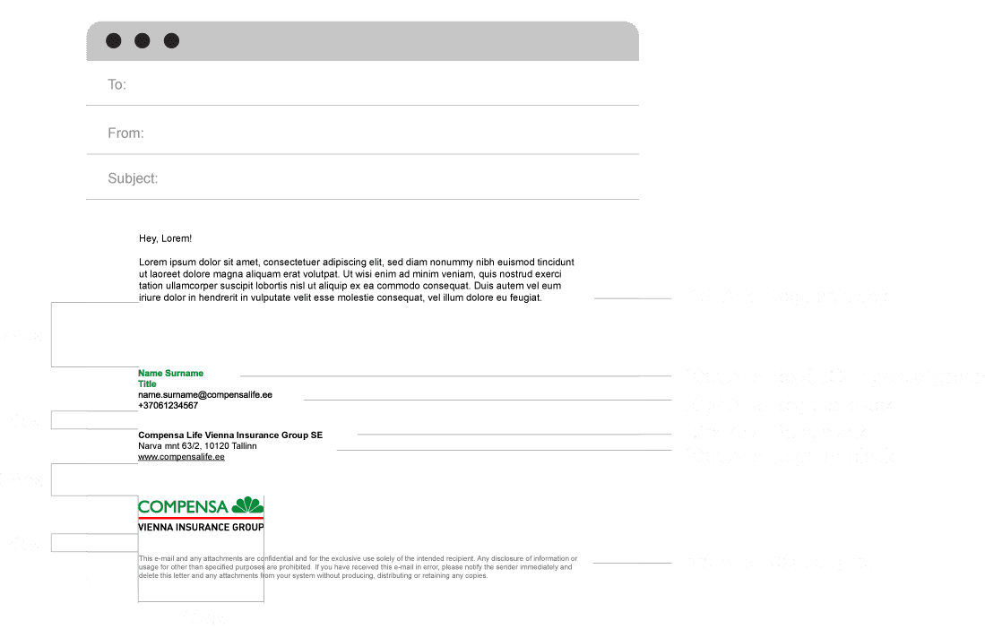
E-mail signature
E-mail signature
E-mail signature
Annual financial statements
Annual financial statements
Annual financial statements
This diagram shows the distances between the compositional elements in the annual financial statement template, as well as font sizes.
The format of the annual financial statements is A4. It is important to note that the outer margin of the inside pages is 17 mm, the inner margin, 25 mm.
This diagram shows the distances between the compositional elements in the annual financial statement template, as well as font sizes.
The format of the annual financial statements is A4. It is important to note that the outer margin of the inside pages is 17 mm, the inner margin, 25 mm.
This diagram shows the distances between the compositional elements in the annual financial statement template, as well as font sizes.
The format of the annual financial statements is A4. It is important to note that the outer margin of the inside pages is 17 mm, the inner margin, 25 mm.

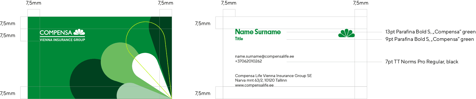
Business cards
Business cards
Business cards
The size of a business card is 88.9 x 50.8 mm.
That is the standard size the fits most card holders.
The size of a business card is 88.9 x 50.8 mm.
That is the standard size the fits most card holders.
The size of a business card is 88.9 x 50.8 mm.
That is the standard size the fits most card holders.
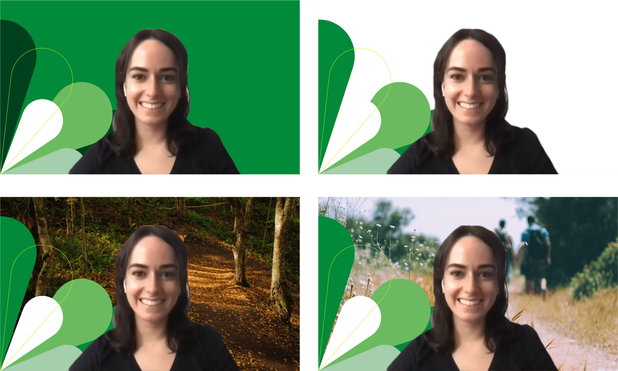
Video conference backgrounds
Video conference backgrounds
Video conference backgrounds
Video conference backgrounds are used with applications such as Zoom, Google Meets, Microsoft Teams.
The format of the vignette is 1920 x 1080 px.
Vaizdo konferencijos fonai naudojami tokiose programose kaip „Zoom“, „Google Meets“, „Microsoft Teams“. Užsklandos formatas – 1920 x 1080 px.
Vaizdo konferencijos fonai naudojami tokiose programose kaip „Zoom“, „Google Meets“, „Microsoft Teams“. Užsklandos formatas – 1920 x 1080 px.
Locked screen vignette
Locked screen vignette
Locked screen vignette

Presentation template
Presentation template
Presentation template
The presentation template is available in the ppt format.
The format of the presentation is 1920 x 1080 px.
The presentation template is available in the ppt format.
The format of the presentation is 1920 x 1080 px.
The presentation template is available in the ppt format.
The format of the presentation is 1920 x 1080 px.

Hypothetical website
Hypothetical website
Hypothetical website
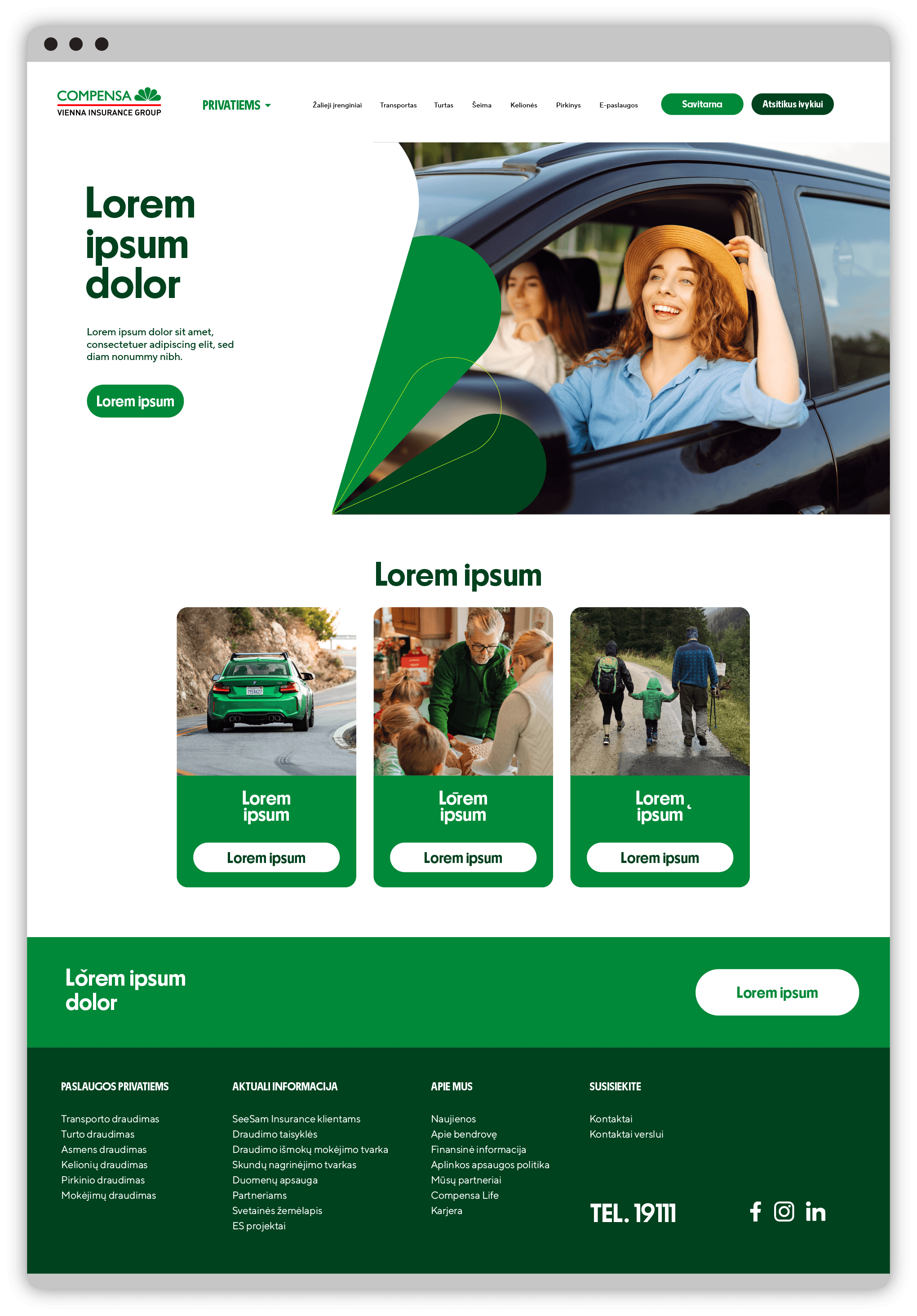
Vizualinio identiteto gairės veikia tik desktop versijoje. Atidarykite šią nuorodą kompiuteryje arba padidinkite naršyklės langą.
Vizualinio identiteto gairės veikia tik desktop versijoje. Atidarykite šią nuorodą kompiuteryje arba padidinkite naršyklės langą.

Stories layouts
Stories layouts
Stories layouts
When it comes to designing layouts for stories, the recommended option is to use the available templates that are aligned with the guidelines of Compensa’s visual identity.
Tools such as bringing the photograph to the foreground and having it extend beyond the boundaries of the graphic element can be used depending on the elements of the photograph. The graphic element may not cover the character in the picture. Another possible option is to have the characters fit inside the frame of the graphic element.
DOWNLOAD TEMPLATES
DOWNLOAD TEMPLATES
DOWNLOAD TEMPLATES